CERAMICUPS
CERAMICUPS is on a mission to create a social movement in Oaxaca, Mexico, by introducing an eco-friendly solution to the single-use takeaway cups found in local cafes and restaurants.
-
CERAMICUPS uses locally-sourced natural materials to create their reusable ceramic cups, from seasonal clays to mineral glazes.
CERAMICUPS partners with local cafes, which offer their clients a free coffee with any purchase of a cup and a discount when returning with any reusable cup for takeaway coffees.
Most cups make it out of the kiln unscathed. However, the cups that don't result in commercial quality (such as flaws in the glazing or not fitting the silicon lid properly) are resold at a lower price or made into candles.
-
☞ Product Development
☞ Naming
☞ Brand Strategy
☞ Marketing Strategy
☞ Logo Design
☞ Visual Identity
☞ Verbal Identity
☞ Copywriting
☞ Art Direction
☞ Photography
☞ Digital Design
☞ Social Content -
☞ Mogote Ceramica
☞ Shava Cueva Photography

Project Objectives
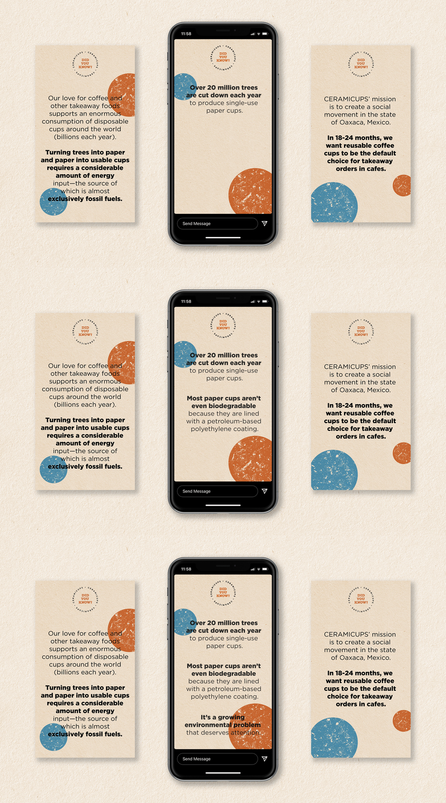
CERAMICUPS required complete product development with fun, punchy branding to promote the cups while educating the consumer on the positive environmental impact of utilising reusable cups.

Naming
With both English and Spanish-speaking audiences to consider, the project required a memorable name that was both easy to pronounce and spell for everyone. I took a leaf out of trailblazer Keep Cup's book, which set the standard for reusable cups in Australia. I wanted a name that would future-proof against competitors by applying a word or phrase that could potentially be used across all brands of reusable ceramic cups. Thus, CERAMICUPS was born.

Product Design
We wanted to create a product that was not only great in quality, but something people would be proud of purchasing. Something beautiful yet also sturdy enough to travel with, lightweight to carry, and able to fit under espresso machines and in car cup holders.
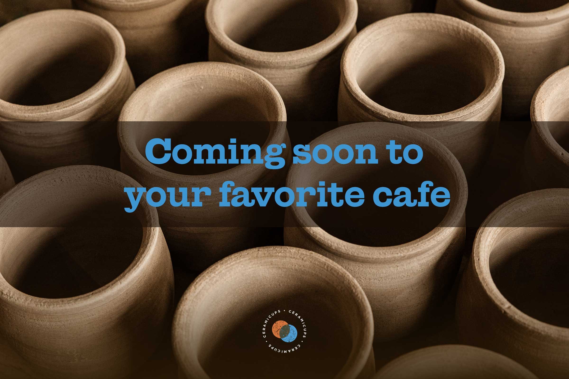
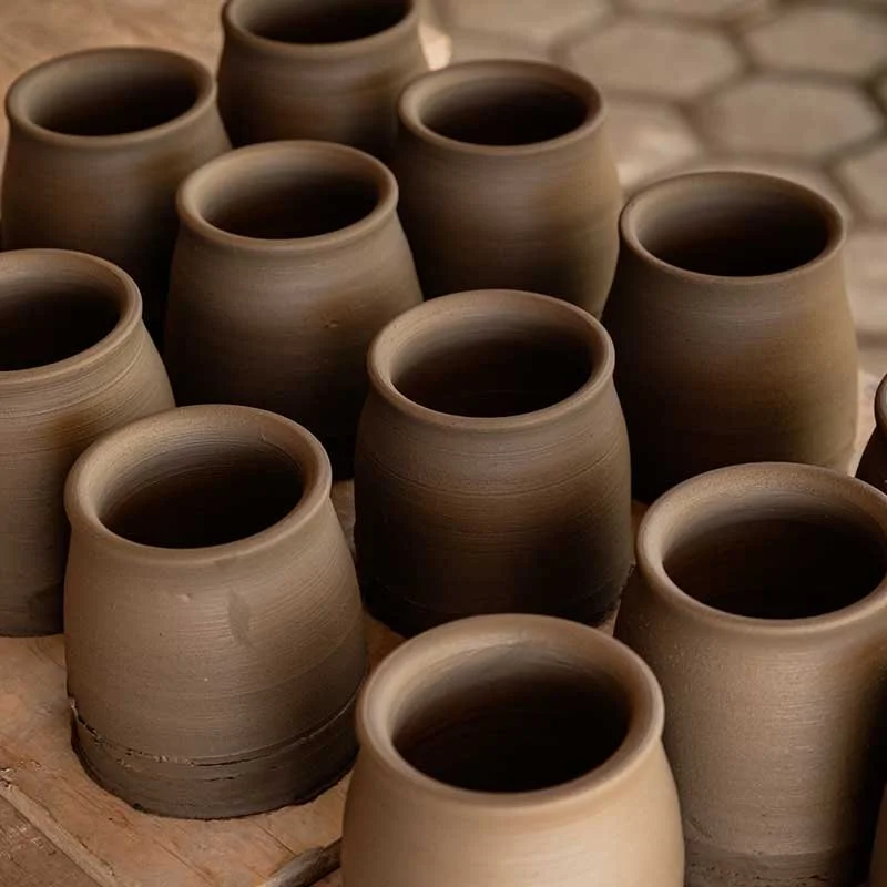
After many months of testing the ideal form, capacity, weight, resistance, and heat retention of various materials with multiple artisans, we chose to collaborate with the local team at Mogote Cerámica in Oaxaca to bring this product to life by hand. As a result, each piece is unique and slightly different in form and colour from the last. The clays and mineral glazes for every cup are sourced from the small town of San Martín Tilcajete, Oaxaca, where they're made.

Brand Strategy
Our purpose from the very start was always to create a project that encouraged recycling and reduced waste in Oaxaca. We had two primary target audiences: cafe owners to stock and sell the cups and those who visit cafes to buy them. It was essential for CERAMICUPS to partner with cafeterias that shared our values to promote the reduce, reuse, recycle messaging beyond our brand. To encourage people to avoid using disposable cups, we requested that our partner cafes offer their customers a free coffee with any CERAMICUPS purchase and ongoing discounted takeaways for customers returning with any reusable receptacle, a trend not yet normalised in Oaxaca.
The creation process was a crucial part of the messaging. Shining a light on the devoted team who created the product with local materials in the most sustainable way possible was essential to our brand communication. So we interviewed each of the artisans at Mogote to tell their personal stories on our Instagram page, ensuring that we gave credit where credit was due.
CUSTOMER ARCHETYPE
The Conscious Explorer
POSITIONING
CERAMICUPS provides an eco-friendly solution to the waste problem in Oaxaca for locals and travellers who celebrate locally-made traditional artisanal products.
TAGLINE
We want to preserve our earth like you preserved pickles during the pandemic.


Visual Identity
The climate crisis can be a stressful topic, so we wanted to avoid the impending doom messaging while encouraging action and accountability with warm, playful, inspiring visuals. Combining modern and nostalgic elements to promote ideas of preservation formed the visual identity.
The aesthetic and colour palette was inspired by a mood board of our good friend and audience persona Mel, who loves 70's rock bands, vintage penguin books and sustainable living.
The logo lockup was designed to fit under the base of each cup and for an Instagram profile image crop. Conceptually merging the two C's of "CERAMICUPS" created the two-circle icon to accompany the wordmark.
We used soft shadows in our photography with warm brown filters to evoke an earthy, cosy cafe vibe.

Verbal Identity
Using playful copywriting was essential to bring the brand to life with a strong personality and connect with our audience. We carried through the themes of throwback heritage and conservation in our tagline to complement our vintage visuals.


Launching To Market
The creative assets were rolled out with accompanying copy in American English and Spanish for our local audience on our sole marketing platform, Instagram. The marketing campaign was launched a few weeks before the first release of the cups to build hype and educate our audience on our mission, our team and the creation process.

Success Story
CERAMICUPS, to this day, has been a hit in Oaxaca City. Since its launch, local cafes have scooped up each small batch of cups within days, and the waitlist for orders continues to grow. CERAMICUPS has gained a following not only from Mexico nationally but also globally, with interest from the USA, Canada and Australia. For now, CERAMICUPS remains an Oaxaca-only project, with the potential to grow into other markets in the future.


